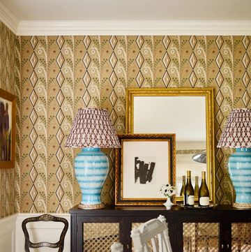
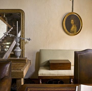
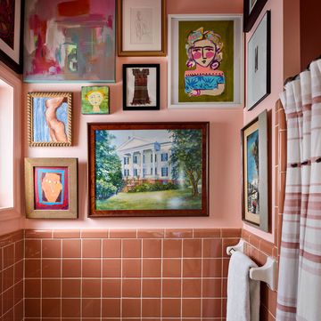
If you're staring down a white room and a whole deck of paint chips, picking the colors can be a daunting task. Arm yourself with these designers' no-fail color pairings and brighten up any space.
As a general rule of thumb, Taniya Nayak, interior designer from HGTV and Food Network's "Restaurant Impossible," advises clients to use five to seven variations of the same color. Think of it in terms of choosing a full paint strip — on one end, you've got a really light color, and the other a dark color.
"If you use one strip throughout your entire space, what you want to do is bounce two shades lighter or darker than the room you're looking into," says Nayak. "If you're going to go lighter in the living room, you want to go two shades darker for the dining room, and if you do an accent wall in a deeper color, it does wonders for making a space feel rich."
"I tend to keep my bigger furniture items like furniture, carpets or window treatments neutral," she adds.
Take a look at a few designers' out-of-the-box color ideas:
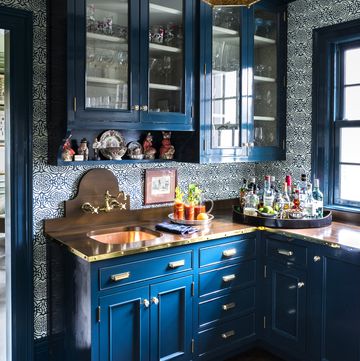
1. Deep Teal and Cognac
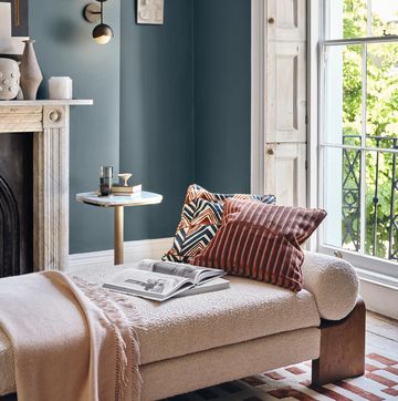
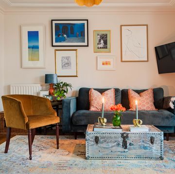
These two rich colors always work well together. "I find that a deep teal paired with a saddle brown or a soft mustard tone complements gray and natural wood tones," says Nayak. "It has a sophisticated look, and they work really well with brown, grays, and whites. Utilizing these neutral colors, you can do anything you want when it comes to adding texture."
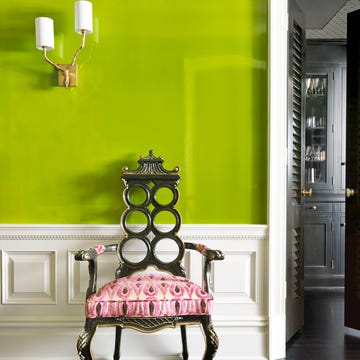
2. Orange, Brown, and Chartreuse
Brown creates the perfect backdrop for these two very different, bold colors. "Orange is a very individual color, if I were to put an Hermès box on a table it looks amazing. It's a color that you identify with but you don't want to be steeped in," Jeff Andrews of Jeff Andrews Design says. "If you want to do a touch of color it should be original. Chartreuse is the same way and is so underrated. Orange and chartreuse like each other." But stay away from pastel orange, Andrews advises — it's wimpy.
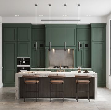
3. Emerald and Mint
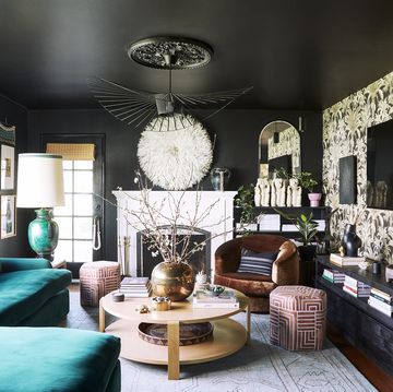
Green is an incredibly versatile color and it pairs well with pretty much any other color explains interior designer, Alexandra Kaehler of Alexandra Kaehler Design, no matter what room you're using it in. "It creates a lot of interest and they're both in the green family but are such different saturations of green, it doesn't look like a green circus," says Kaehler. If you're trying to make it feel bright and fresh, pair these two colors with white walls or you can add a deep rich green with brown and all of a sudden it creates a rich, masculine energy.
4. Dusty Purple, Cream and Taupe
These dreamy colorsgive a room a monochromatic, soothing look. Andrews recommends layering similar colors to create a harmonious room. "Working within one color family lends a sophistication that doesn't need that obligatory pop of color," says Andrews. "I love a soft and subtle palette, but then I add in some edge. Different textures really play an essential role if you're going to do several shades of one color. It's the texture that sets everything apart."
5. Navy Blue, White, and Wood
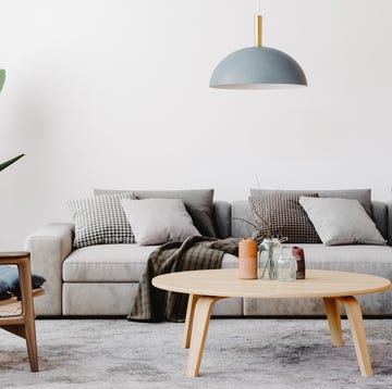
Pairing navy blue and white with a walnut tone or grayish wood would make for the perfect color palette. "The contrast between the navy and white allows everything to be its own star," says Nayak. "It allows each item to shine. You can mix any other color in there and it will look outstanding." Add a metallic in like a shiny gold, brass, or chrome, and the room ends up looking very fresh, clean, and bright.
6. Yellow and Green
When people are looking for a fun pop of color you can count on this retro '70s pairing. "These colors work together because they are slight derivatives of one another. They're in the same sort of palette, but are different enough to add contrast," says Andrews. "I think for every light color in a room there needs to be something darker to ground it — even if it's not a color, even if it's a metal finish. There has to be dimension in a room." Just beware of using pattern with these colors; otherwise it could look a little too retro.
More Color Ideas from House Beautiful:
• Living Room Color Ideas That Feel Anything But Ordinary


